Creating a visual identity that makes blockchain and fintech feel constructed rather than decorative.
TL;DR
- Context
- NYU BnF’s original website had a distinctive presence - saturated purple, oversized typography, and generous whitespace - but lacked a consistent design system. The redesign kept that energy while making the experience more intentional and actionable.
- My Role
- I owned the web design end-to-end: visual direction, hierarchy, typography, color, motion, and interaction.
- Outcome
- The updated site preserves the purple identity, logo, bold type, and emphasis on activity, and replaces the missing design language with a recurring Rubik’s Cube motif, program-led storytelling, purposeful motion, and a clearer route to apply.
- Learning
- A redesign can preserve the emotional equity of its source while giving that identity a more useful role.
- Thanks
- Tate Leland, Chengzhi Wang
The original website had some personality, but not a continuous story
The liquid purple hero and oversized cropped wordmark gave the original site more character than a conventional student-club website. It also covered the usual checklist: social posts, team descriptions, partner logos, and e-board info.
There were flashes of intrigue, but they felt disconnected. The hero set an exciting atmosphere, the accordion explained internal teams, and the social feed added proof - yet visitors still had to work to determine what the club offered them.
Core challenge: Preserve the original site’s boldness while making the experience more coherent, specific, and actionable.
The redesign kept the confidence but changed the metaphor
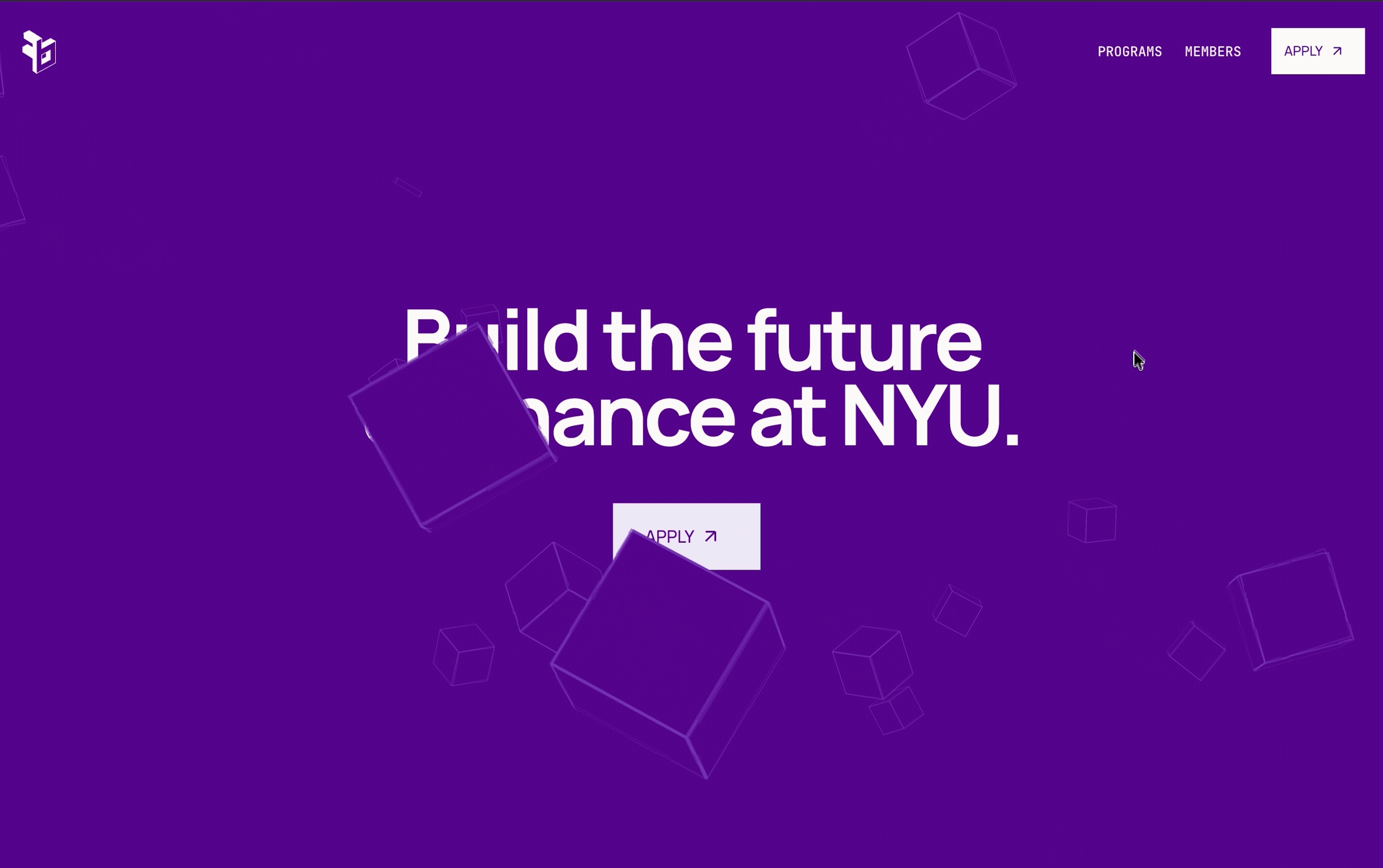
Where the original identity was fluid, photographic, and editorial, the redesign emphasizes structure. Purple became the environment rather than a decorative accent, and the vortex gave way to a Rubik’s Cube - a way to make blockchain and fintech feel constructed, modular, and solvable rather than decorative.
Sharp panels, fine grids, and dimensional forms reinforce that built world. The shift appends “BnF is cool and energetic” with “BnF is a place where students make things.”
The narrative improved through subtraction before motion: early drafts tried to explain too much, so the site was cut down to ambition, member experience, industry connections, program paths, activity, and an invite to join. Only then did the interactions get more expressive.
The redesigned hero is a story about construction
The hero opens with pieces assembling into a Rubik’s Cube, rotating, bursting apart, and settling into a field of falling cubes. The headline - “Build the future of finance at NYU.” - arrives during that transformation, so motion shows construction before the copy claims it.
Generic benefits became concrete reasons to join
Feature cards moved from “Learn,” “Build,” and “Invest” to four clearer promises:
- Learn About Markets
- Build Fintech Products
- Invest Onchain Together
- Meet Industry Leaders
The fourth card recognizes that access to Web3 and fintech operators is a distinct part of the club’s value. Each benefit gets its own moment in a scroll-driven rotating cube sequence, trading grid density for weight.
Basic team names became pathways based on student intent
The original accordion foregrounded internal structure: Development, Investment, Coinbase Product, and Mentorship. The redesigned carousel starts from how prospective members see themselves:
- For builders: Kalshi Development Team
- For strategists: Coinbase Product Team
- For investors: BnF Investment Team
- For newcomers: BnF Mentorship Program
That shifts the question from “How is the club organized?” to “Where might I belong?” Partner lockups make external collaborations feel more credible.
The application experience completes the narrative
The redesign prioritizes programs and applications over e-board and contact info. The only navbar and hero CTA is “Apply.” At the bottom of the page, two cards offer next steps - Apply Soon and Questions? - so visitors meet the club’s promise, programs, partners, and activity before committing.
The story moves from “this is who we are” to “this is what you can become part of.”
You can check out the website here.