Transforming a disorderly collection of flashy visuals into a restrained and repeatable design system.
TL;DR
- Context
- NYU’s Product Management Club site was visually ambitious but lacked a shared design grammar. The redesign kept the interlocking rings, cyan accents, dark atmosphere, and modern typography, then rebuilt everything else as a coherent system of geometry, color, layout, photography, and motion.
- Outcome
- A responsive 16-page experience that feels recognizably like PMC across programs, events, teams, resources, and editorial content.
Competing ideas are the markings of a poor web experience
The predecessor had confidence - the cyan-on-black palette felt technological, the interlocking-ring logo was memorable, and oversized headings gave each page a clear focal point. What made it incoherent was the lack of a stable visual language.
Each composition was expressive in isolation, but the expressions competed for ownership of the brand. Moving between pages felt like entering a new visual experiment. New pages required inventing another hero treatment rather than drawing from a shared system, and flashy animation became the default method for creating distinction.
The challenge was to balance ambition with discipline.
The redesign identified what was actually worth keeping
It retained:
- The interlocking three-ring mark
- A dark, technology-forward atmosphere
- Cyan as the primary brand signal
- Direct sans-serif typography
- The Events, Programs, and Team navigation model
It moved away from:
- Clashing visual metaphors
- Glows and texture as default forms of emphasis
- An almost exclusively black interface
- Large compositions containing relatively little information
- Motion and imagery without a meaningful behavioral role
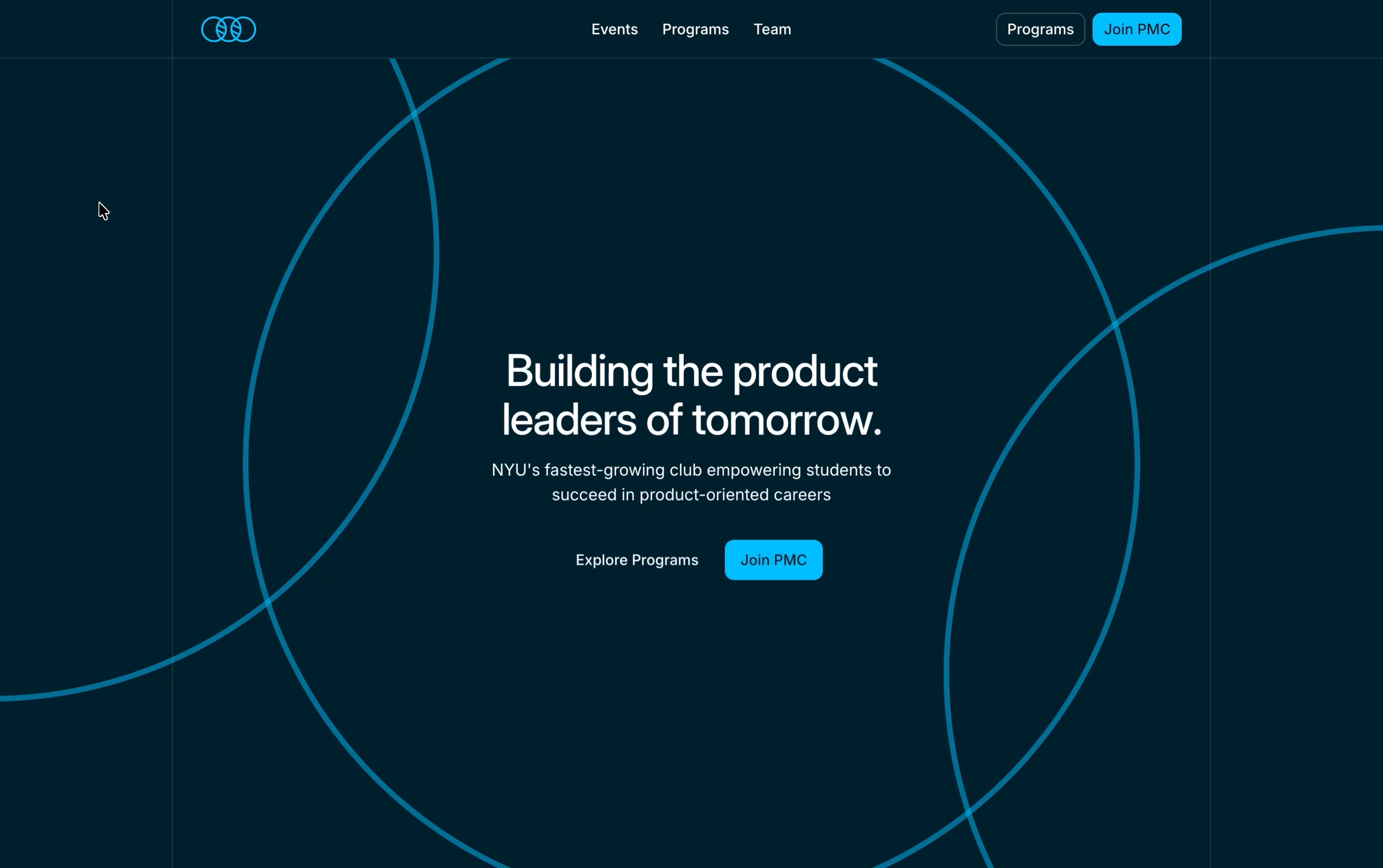
One piece of geometry became the core visual
The logo’s interlocking rings - meant to symbolize the intersection of disciplines product managers operate in - became the primary graphic device across the redesign.
Instead of reconstructing them from glowing characters, the updated site uses clean, oversized outlines that pass beyond the viewport and frame hero content. The rings can orbit, respond to the cursor, or stay still, but the underlying form stays consistent. That made the identity more ownable: the dominant visual device comes from PMC’s mark rather than a generic futuristic aesthetic.
The same restraint carries through the supporting system. A fixed content rail, fine dividing lines, modest radii, consistent spacing, and repeated section structures create continuity. Inter provides a neutral typographic base so scale and placement carry hierarchy. Dark and light surfaces get defined roles - dark for emphasis, light for rest - so the experience no longer competes at one visual volume.
Photography replaces abstraction where community evidence matters, with a controlled blue wash and color-reveal interactions that introduce warmth on engagement. The brand still feels technological without being anonymous.
Systematization was the real visual upgrade
Spacing, borders, typography, buttons, and motion became reusable decisions rather than page-level inventions. The site is also drastically snappier without the predecessor’s heavy WebGL.
The tradeoff is clear: the updated site is less aggressively futuristic on first load. In exchange, it gained coherence, credibility, responsiveness, and enough structural consistency to grow without diluting the brand.
I learned how to identify the few key ideas with enough strength to repeat, then quiet the rest.
You can check out the website here.