Preserving EmpowerED’s mission and credibility while crafting a more distinctive and charming digital identity.
TL;DR
- Context
- EmpowerED is an NYU student-led consultancy serving schools and education nonprofits. Its previous website communicated the right information, but a sparse corporate presentation didn’t express what made the organization distinctive.
- Outcome
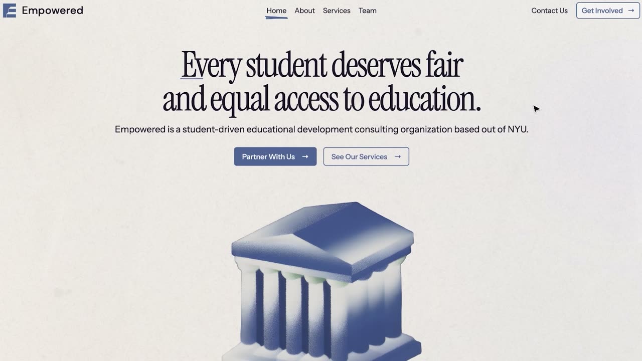
- A responsive six-page redesign grounded in educational materials - paper, books, yearbooks, and annotations - with clearer audience pathways and richer organizational proof.
- Takeaway
- The more the website looked and behaved like something made within the world of education, the less it needed to explain that EmpowerED was student-led. Identity became convincing through experiential details instead of repeated claims.
The original site had the right message, but lacked character
The preceding site did important things well: mission up front, a credible blue brand, partner logos and testimonials, and a comparison between two nearby New York schools that made educational inequity concrete. Handwritten underlines added a human note inside an otherwise cold experience.
Large white space, oversized sans-serif headings, thin dividers, and isolated periwinkle sections still read as generic consulting. Pages felt like separate presentations rather than one system - a student-led education organization described, not felt.
Core challenge: Make the site more expressive of EmpowerED’s student-led identity without weakening the professionalism nonprofit partners expect.
The redesign made the brand feel more spirited
The redesign kept the blue foundation, equity message, handwritten emphasis, partner proof, team photography, school comparison, and join/partner pathways - then reinterpreted them.
The most impactful change was textural. Where the original floated content on empty white, the redesign behaves like an organized scrapbook of educational objects on paper: warm backgrounds, dark ink, compact lockup, and handwriting reserved for annotations. That metaphor scales across every page without needing a new hero idea each time.
Reorganizing the content clarified the visitor journey
The original homepage tried to hold mission, school comparison, services, partners, testimonial, and conversion in one long sequence. The redesign orders belief, evidence, and method before an invitation to partner or participate.
- Get Involved places “Join as a Student” and “Partner as a Nonprofit” side by side, making the two audiences explicit.
- Contact turns a conventional form into notebook paper and an envelope, so the final interaction belongs to the brand.
Motion adds narrative and feedback
The envelope interaction is the clearest example. The visitor writes on notebook paper, sends it into an envelope, and is directed to a prepared email - turning a usually dry website action into something that feels made for EmpowerED.
You can check out the website here.