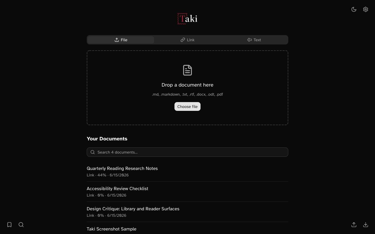
A local-first reader app that turns documents and webpages into focused reading sessions.
TL;DR
- Context
- Taki began as a focused speed-reading tool and evolved into a complete reading workflow. Readers can import material, control how much context they see, search or save important moments, and return to the exact place they left.
- My Role
- I owned this product end-to-end, including ideation, scoping, design, and development.
- Learning
- Focused interfaces work best when context is progressively disclosed. I learned how to better balance speed and calmness with enough control and continuity for readers to remain oriented.
Speed-reading can remove valuable context
Presenting one word at a time reduces eye movement for hyperfocus, but it also removes familiar landmarks from the mode of reading most familiar to users: surrounding sentences, paragraph structure, and the ability to quickly glance backward.
This informed the core design challenge: helping readers stay focused without sacrificing comprehension, while supporting the broader journey without becoming bloated:
capture → focus → recover context → save → resume
The product evolved from playback into a reading system
The first version established Taki’s core interaction: showing a single word at a time at a controllable pace, centered on a consistent focal point, with punctuation-aware timing for complex moments.
Later iterations restored the context that word-by-word reading removes:
- Sentence and paragraph views let readers adjust the granularity.
- Peripheral words preserve continuity without negating focus.
- Headings can pause playback to reorient readers.
- Progress, word count, WPM, and time estimates make playback legible.
- Search, bookmarks, highlights, and dictionary entries support expected e-reader interactions.
In the final implementation, files, pasted text, and captured webpages all feed into one local library, with progress and saved items remaining on-device.
The key decision: make context adjustable
Despite RSVP-style speed-reading being the core feature, Taki doesn’t treat maximum focus as universally correct. Readers can choose how much context they need - word, sentence, or paragraph - while bookmarks and highlights preserve meaningful locations for later. Context is progressively available rather than permanently visible.
The tradeoff: calmness versus discoverability
Taki keeps the central reader deliberately sparse. Secondary tools live in corner controls, settings, keyboard shortcuts, and native menus. That protects concentration, but it can make features less discoverable for first-time readers. Tooltips and a shortcuts overlay help; a fuller product would need careful onboarding that doesn’t inundate people.
Outcome
Taki is live as a macOS application and Chrome extension with around 40 users, mostly through my network and word of mouth, and about six people use it on a typical day.
Reflection
A focused interface should hide complexity while keeping agency within reach.
You can check out the website here.